Warner Bros. Updated Their New Logo
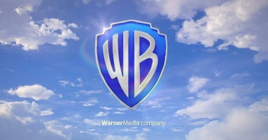
Warner Bros. recently launched their new logo, which is giving a fresh glimpse of the film studio.
Warner Bros. Entertainment Inc. (abbreviated as WB) is a multinational entertainment and mass media multi-industry company. The studio was founded 97 years ago, on 4 April 1923. The Warner brothers, including Harry, Albert, Sam, and Jack Warner, founded the company together. Over time the studio was established as one of the leaders of the movie industry.
The studio was later divided into five groups: New Line Cinema, the Warner Animation Group, Warner Bros. Pictures, Castle Rock Entertainment, and DC Films. The logo of the company has changed many times before. In the past 15 years, the studio has over 200 variants of stylized logos and around 13 official logos to date. However, except for the color variations, all of the logos (designed by Saul Bass) are the same, with the initials of the studio’s name stamped inside the shield.
The previous logo was designed about ten years ago. Now the studio has redesigned the logo. The logo was tweeted on Twitter by Cartoon Crave and captioned as “Here’s a better look at the new Warner Bros. Pictures logo. From the HBO Max Original Film, ‘Locked Down.’”
To check the post referred to the official Twitter account of Cartoon Crave @thecartooncrave.
The new logo connects well with the HBO Max reboot of the cartoon Looney Tunes. Warner Bros. has changed the latest logo the most since the 70s version. However, the 70’s logo was soon faded out, and the studio launched the traditional one in the 80s.
In 1984, the studio launched the logo with the initials (WB) imposed on the traditional Warner Bros. shield, with gold trim over cloud-filled blue sky. There were some little changes, but they were mostly the same.
The Pentagram design studio designed the new version logo of the Warner Bros. The new logo depicted the new generation and dropped the golden tone. It consists of a two-color scheme, blue and white. It also does not have the previous band of “Warner Bros. Pictures.” The new logo of the studio is text free. The clouds at the background of the new logo look more realistic than the earlier one.
The updated logo maintains the same basic design, only becomes more streamlined, which makes it look better. The logo premiered in theaters on 26 August 2020 during the screening of Christopher Nolan’s Tenet.
The studio changed the logo as it is planning to expand its business into digital and streaming platforms. The traditional logo looks classic, but it was too broad to scaled down to the letterhead and business card.
The updated logo is more contemporary. However, some fans might take little time to get used to the new version.
Source :- https://activatebitcentral.com/warner-bros-updated-their-new-logo/


Comments
Post a Comment